Plot it
Playing around with the new Hops tools, I’ve decided to implement the Matplotlib tools to run inside of Grasshopper
While Grasshopper is a great way design by data , I’ve always found its ability to display raw data quickly, a bit tedious at times.
With Hops around the corner, I took the opportunity to implement the Matplotlib library to run directly inside of Grasshopper.
Hops allows for new ways of creating functions inside of Grasshopper. Theses functions can be made of other Grasshopper definitions or but also CPython. This Python version (instead of the previous IronPython) allows users to work with any library available with CPython, and that’s why I gave a go at bringing the matplotlib library inside of Grasshopper.
Fort a more lazy approach, I’ve decided to use CPython’s library Seaborn, which runs on top of Matplotlib. It sure doesn’t do all the things that Matplotlib can, nor has all the settings, but once combined with CPython’s Panda library, things can get graphed really fast. The ease for creating basic graphs, despite the lack of settings, is what I was looking for this first version.
DATATYPES & WORKFLOW
As mentioned a moment ago, the process would involve Grasshopper (+Hops), Panda & Seaborn.
The aim is to feed some Hops components with data created directly from a Grasshopper model, and receive a beautiful (and hopefully meaningful) graph representing that data.
Grasshopper works with datatrees which, despite being sometimes a bit confusing to some, are really powerful when used extensively. Their structure ressembles to a dictionary (in code), where value(s) (the item(s)) are accessible through a key (the path). The path itself (by its nomenclature) also gives some information to the user about the project, and will become useful for this exercice.
Panda works with dataframes, which look a little bit like an Excel sheet, or Google sheet. Theses data tables have user defined column titles, with data for each row, accessible via an index.
Seaborn, as mentioned earlier, is a library that runs on top of Matplotlib, but has been made easier to use, especially when using Panda’s dataframes.

From datatrees, to graphs though dataframes
SO… HOW DOES IT WORK?
The current (work in progress) version of the “plugin” is made out of 3 groups of components.
- The first group has only one component (for now) that allows the user to query all the plots and palettes that are currently implemented.
- The second has also currently only one component, that builds a string representation of a dataframe, from a datatree.
- The last group contains all the plots, see at the end of the page to see how to switch between all the currently supported plots.
In the mean time, here’s what would look like a complete use of the “plugin”.

Typical workflow
SAMPLE PROJECT
In the model hereunder, two projects sitting in a magnificent city (…eh). They represent the two possible location & orientation for one residential buildings. These projects are therefore essentially two times the exact same project (for ideal comparison).
(disclaimer: this model has been made to illustrate one of the many possible usage of this tool. The model has been made very simplistic for explanation and visual purposes only)
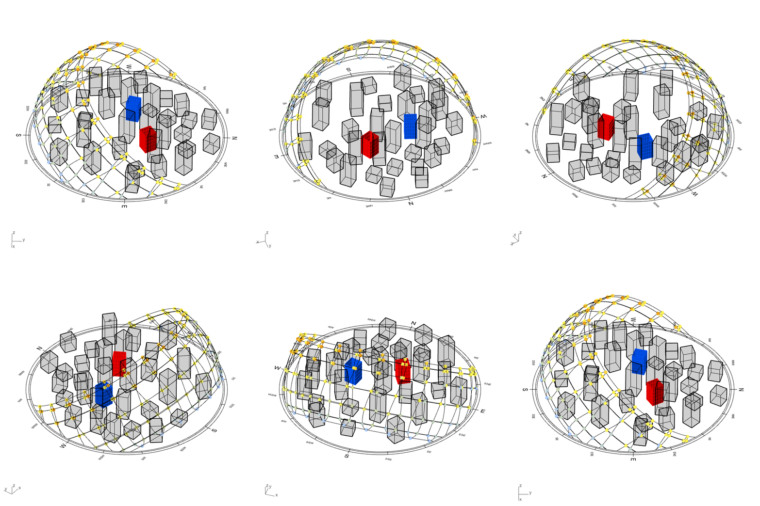
*crying in urban planning*
Onto every windows of both project were made a solar hour analysis, a radiation analysis and a view analysis toward points of interest (let’s say views to Eifel tower, Central Park and Manneken-Pis, that will increase the interests for the apartments).
The objective of this exercice is to try to illustrate which of the two locations is better, based on some of the simulations that were made, and with the help of graphics.
Here right is the datatree that contains all the (two) project’s windows.
It’s organized as follows {A;B;C;D} :
- A: Which project the window is on
- B: Which façade the window is on
- C: Which floor the window is on
- D: Which position (from left to right) is at
Inside of each branch resides (for this example) three items:
- View evaluation for that particular window
- Annual solar hour analysis for that particular window
- Annual solar radiation analysis for that particular window
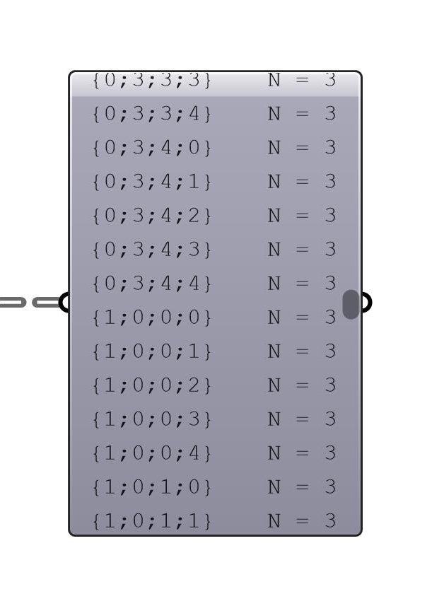
To implement the datatree structure labels into a dataframe, the component “Datatree to Dataframe” asks for a branch label list.
The one that tells what {A;B;C;D} (in this example) means.
For the items in the datatree, I went for a similar approach to the Elefront plugin when it comes to add user attributes to geometries.
A simple label list of what the items represent in each branches.

User gives names to the datatree structure, and the data in each branches
SO WHAT NOW?
With all of that checked, we only need to pick the right graph (and type of graph) we wanna use to analyse the data of the two models.
The plugin currently supports 3 types of graphs: relational, distribution and categorical.
Note: There are no specific ways of analyzing projects, but in practice, you’d wanna analyse the results extensively , with multiple graphs and data comparisons.
Many graphs can be useful to illustrates some benefits or weaknesses of one design over another. In this short and simplistic exercice, I’d just like to bring one graph that, without any fine-tuning, tells already somethings about the two designs.
Let’s say we want to compare the two design’s view ranking against the solar radiation ranking. In the case of a passive building, we could state that one wants to maximize the view score, while minimizing the radiation score (again, simplistic assumption for a simplistic model).
After selecting a KDE plot (distributional), we select what we want to measure on the X and on the Y axis. And finally what is the level of comparison (in this case, we want to compare Project_0 against Project_1).
Press the button, and the image on the right get plotted, and can be saved.
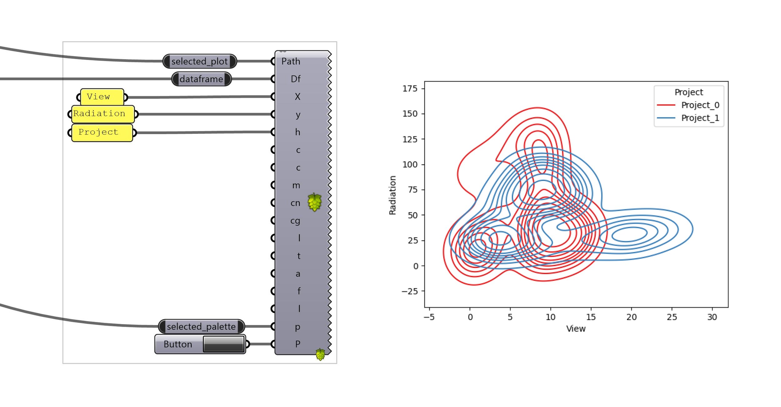
kde plot component, with inputs —> graph produced
One of the interpretations that one could draw from this plotted graph is that Project_0 is receiving more radiations than Project_1 (on the scale of the project) while achieving a smaller score on the view ranking. Therefore, based on this graph only, and on this comparison only (usually you would check way more criteria than this), Project_1 seems to be a better candidate.
From there, we could analyse which time of the day/year the radiations on the project come from, are all the levels affected? Are all the facades too? What about the sunlight hours? Are the radiations causing overheating risks? etc…
An important part of this tool is that it is not project specific. We could have 10 different projects, the workflow stays the same, and all the data can be plotted immediately. Same goes for the number of floors, facades, etc. Even what data you wanna plot (what’s in each branches) could be totally different (and as many as you want) : budget, type of geometry, coordinates, booleans, etc. Workflow stays the same, you simply select the type of graph, the graph, the color, what you wanna compare, press a button and congratulation, you got yourself a plot !
THOUGHTS AND NEXT STEPS
I hope this very naïve example illustrates one of the many way this tool could be useful to architect’s decisions on designs.
The data to be displayed could be anything, and could relate to any parts or areas of a design.
While Hops is great, it is still in development and sometimes shows inconsistencies (within its behavior), and yet lacks some important features. Plus, the community seems to die already from the announcement that GH2 will support CPython. And this also something that stopped me from continuing right now, since the plugin would need a complete rewrite for GH2.
Therefore I’ve decided not to make a standalone plugin on food4Rhino that would run on a server I own, but rather publish it on github for the “more advanced” user to be able to use it and improve it (there’s a lot of room for that :-) ).
Please get in touch if some things aren’t clear, and don’t hesitate to pull request or rewrite your own version ! I’d be curious to see different approaches too !
GALLERY
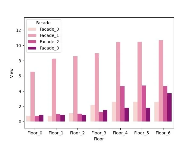
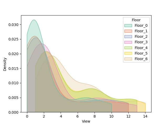
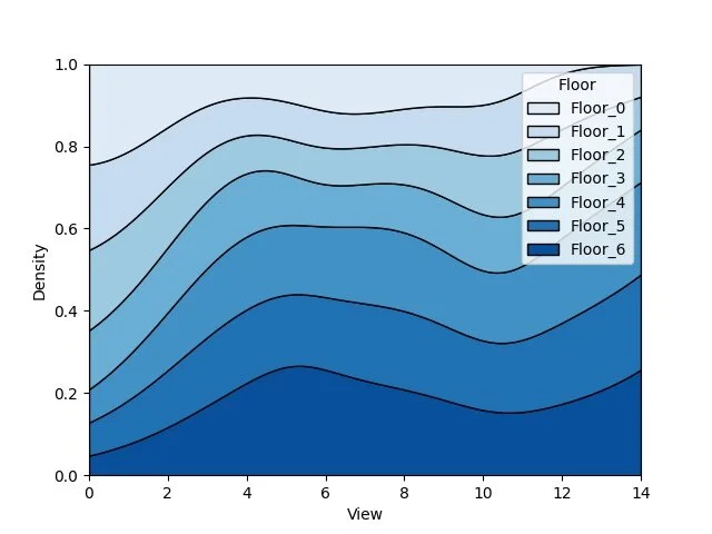
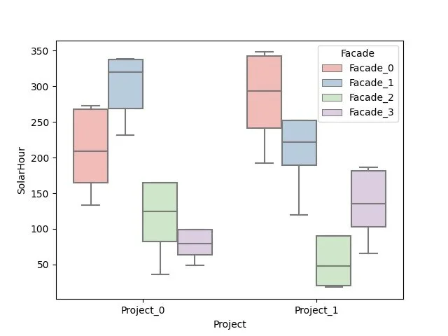
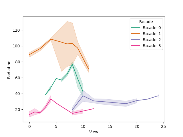
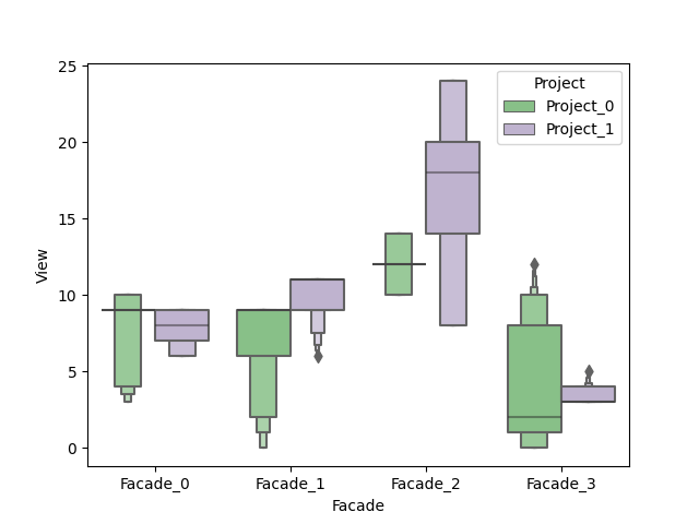
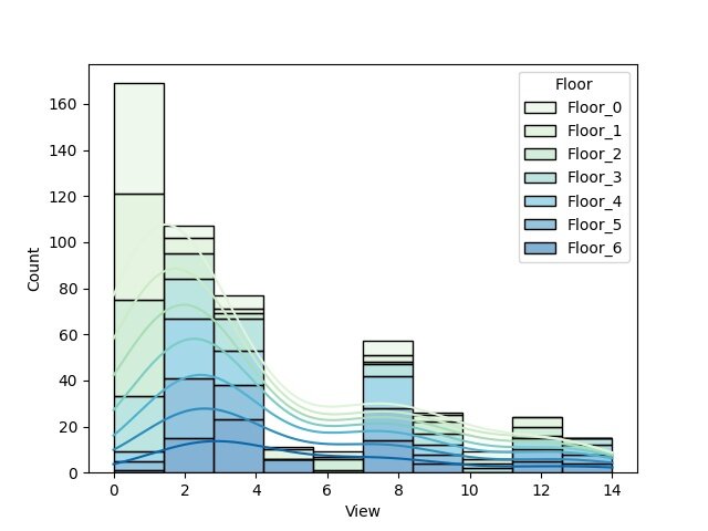
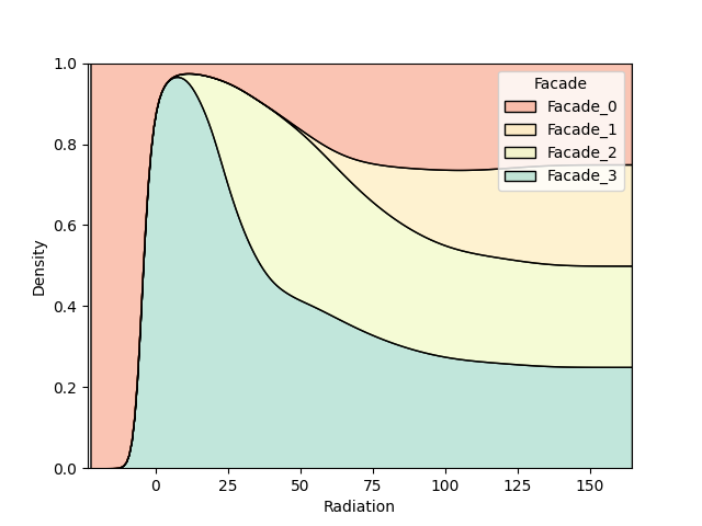
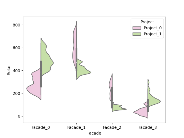
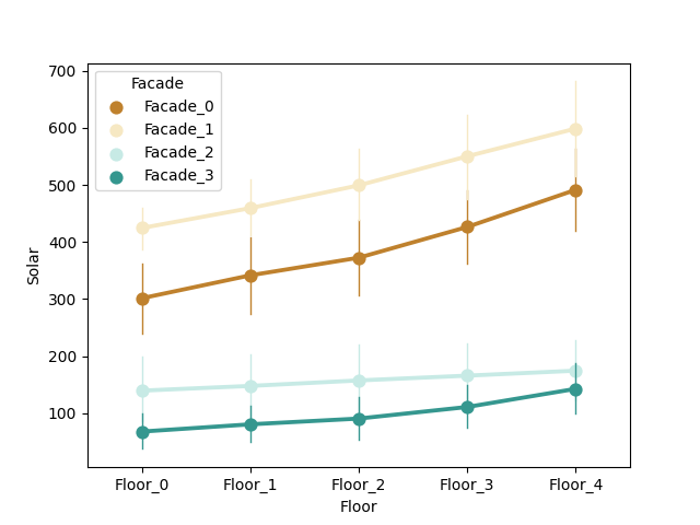
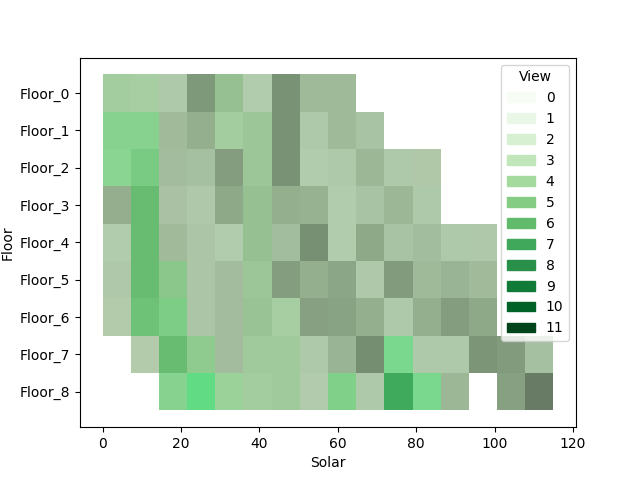
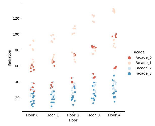
I’ll just lay here some of the graphs that are available as of now. (I have to say that I’m still discovering new graph variants by tweaking the settings during real case uses).

switching between plots, from all the currently supported plots

