Covid-19_Graphs
Here is a small Grasshopper file that will allow you to display the current evolution of COVID-19 (see bottom of the page).
The data is provided by Johns Hopkings CSSE (https://github.com/CSSEGISandData/COVID-19) and has been streamed in Grasshopper by Giulio Piacientino (https://discourse.mcneel.com/t/novel-coronavirus-charts-and-numbers/98177).
From that, I built up a way to display multiple results based on the data provided, with Grasshopper.
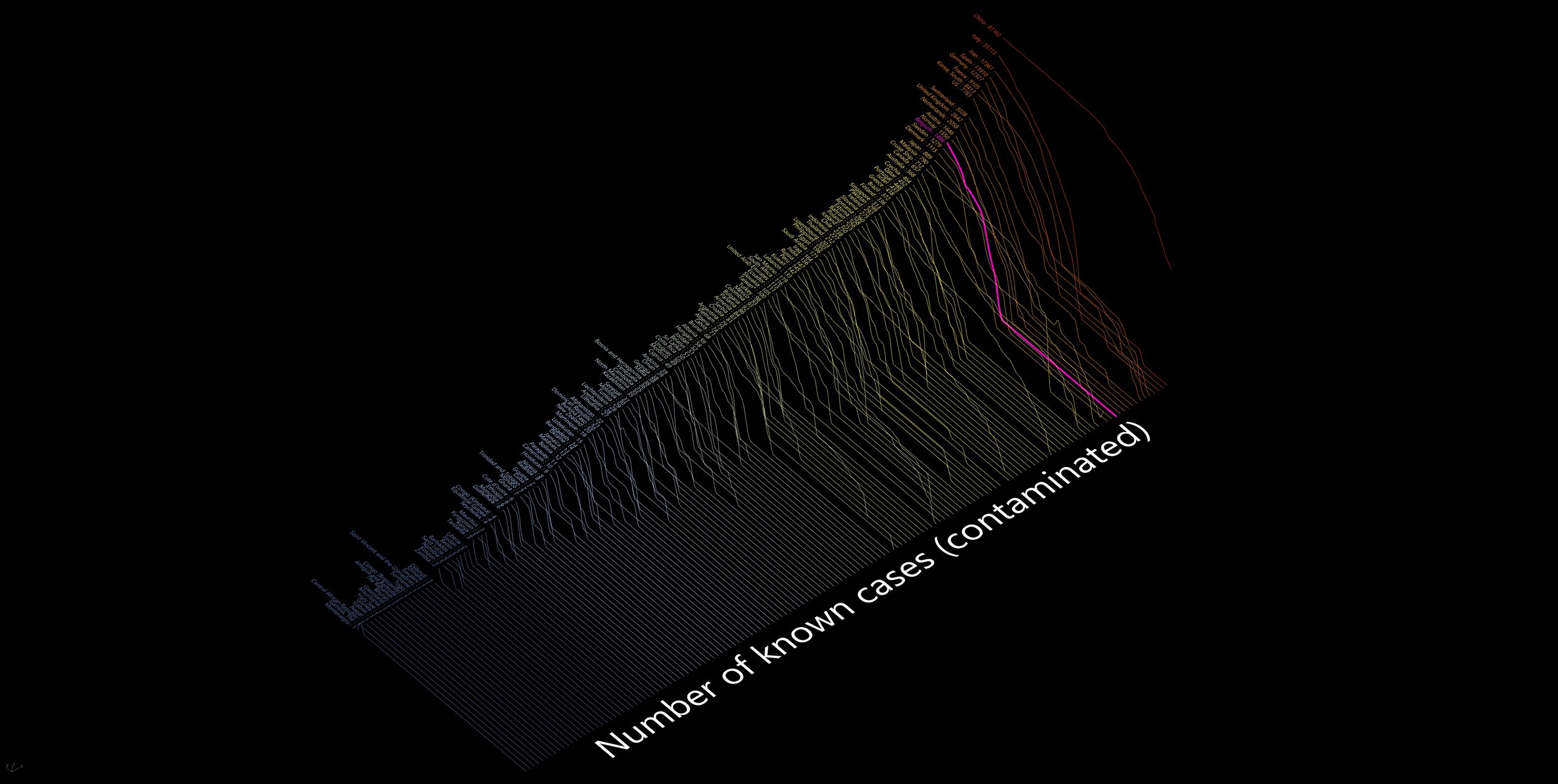
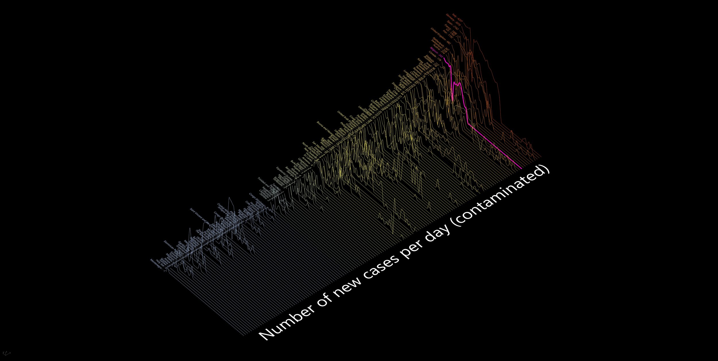
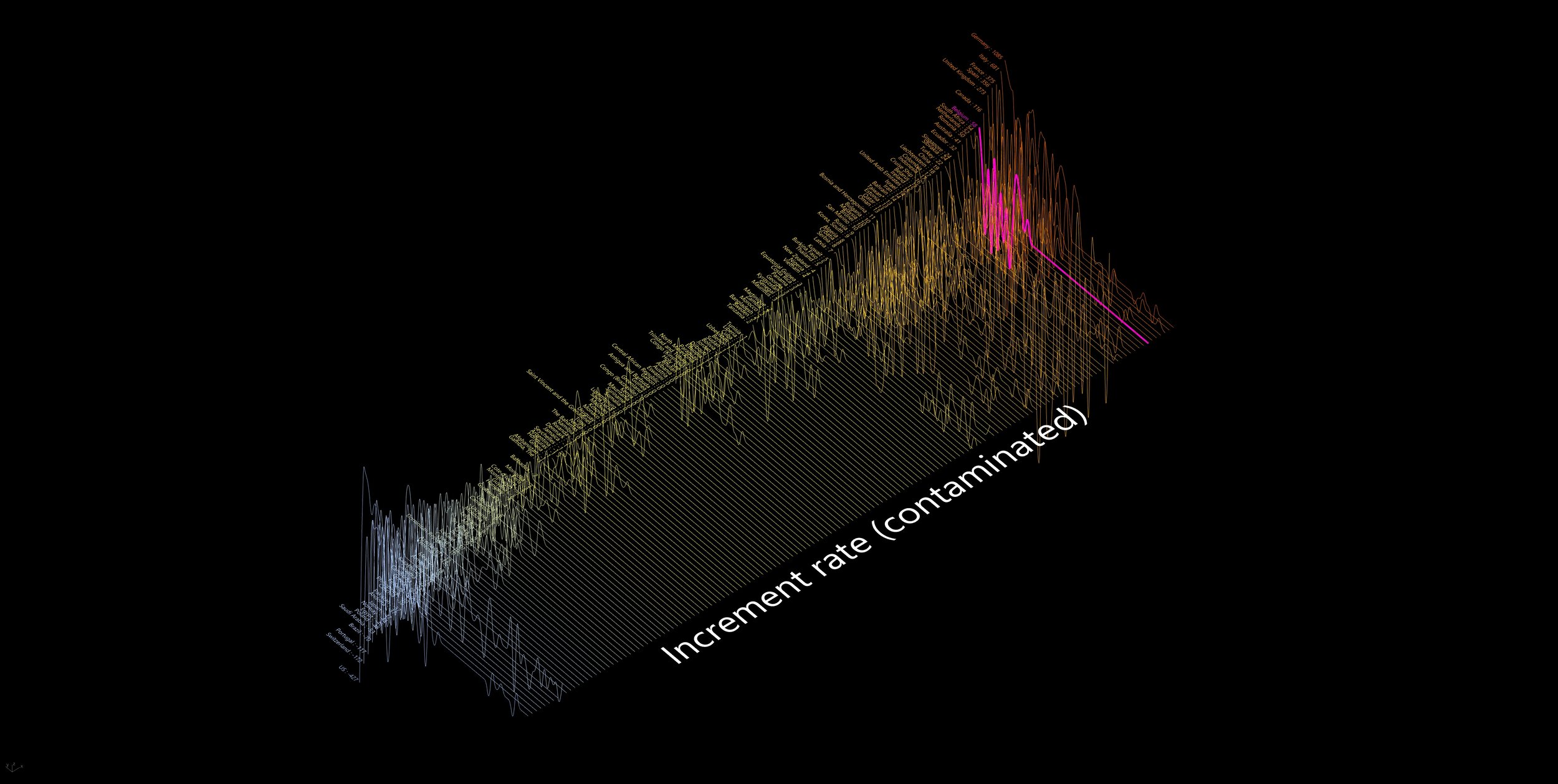
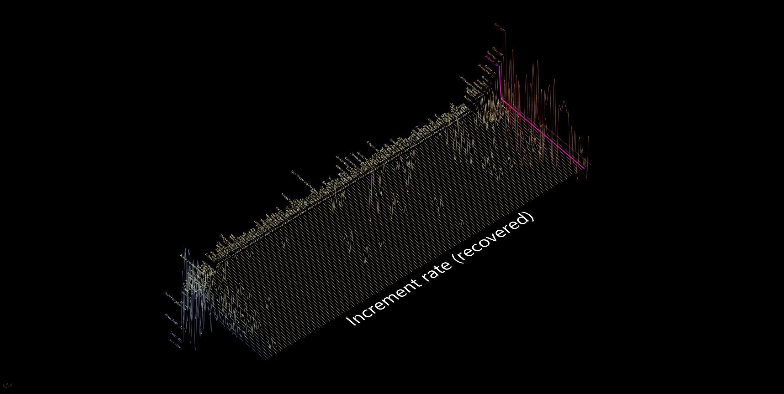
In this file, you can display (for available countries) 3 type of data cases : Contaminated, Dead, Recovered.
For all of these 3 data, you have the possibility to show the “Number of known cases”, “new cases per day” and “incrementation rate”.
You can select the country you want to highlight in pink (in this case it is Belgium).
These graphs will update everyday when you open the file, as long as data is provided. The scales will adjust each time new heights are reached.
Please, keep in mind that the Z axis on a logarithmic scale.
ps : I decline all responsibility or decisions based on these graphs and this Grasshopper file.


Date of the pictures 19th of Mars 2020
Bad quality due to Squarespace limitations…
This file requires you to have Human plugin by Andrew Heumann.
Antoine -
